In the middle of a storm last week the UK achieved its lowest ever carbon intensity for electricity production. The figure was 33 grams per kWh, I have no idea how to understand what this means, how can we visualise and understand this?
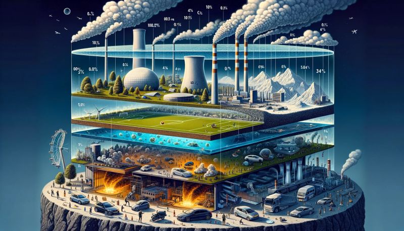
Let’s start by visualising the volume of CO2 – an Olympic sized swimming pool would hold about 5 tonnes of CO2. A tonne of CO2 spread evenly across a football pitch would be about 10cm high.
The UK emits about 500 million tonnes of CO2 per year, if this was a blanket of CO2 spread across the UK surface area it would be just over 1 metre high. The US has a much higher per head CO2 number, but their blanket is about one third the size as their country is so much larger.
A typical car emits about 120g per km travelled, an average car that does 10,000km per year has a tower of CO2 85 metres high above its 8 square metre footprint.
Each human exhales about 1kg of CO2 per day, if we each occupy one metre squared, our CO2 production per year is almost 200 metres high. Food production is about 20-25% efficient, add this and that column of CO2 above our heads is getting towards a kilometre high.
The largest single CO2 emitter in the UK is the Drax power station in Yorkshire, it burns wood pellets, and produced just over 12 million tonnes of CO2 last year, which would stretch up 3 kilometres above its 2 square kilometre site.
Earth’s atmosphere is about 10km high, and CO2 levels are currently about 0.04%, which would be about 4 metres high (ignoring altitude pressure). If we’re adding 1 metre per year, then we’re clearly very reliant on nature removing it.